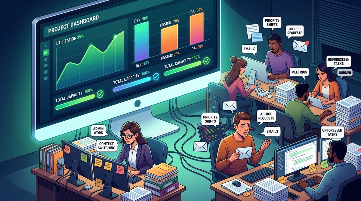
Your project dashboard is a beautiful liar. It tells you that everything is on track, that your team has enough hours in the week, and that the release date is safe. Then the demo gets pushed, someone logs in late on Friday, and you are left wondering where it all went wrong. The truth is, a team capacity planning dashboard shows you a tidy version of reality. It does not show you the messy parts, the hidden bottlenecks, or the quiet overload that your people are too polite to mention.
Most project managers live inside Jira, Asana, or Trello. These tools are fantastic for tracking tasks, but they were never designed to be true capacity planning engines. They show you availability, not actual human bandwidth. They display hours, not energy. They track story points, not cognitive load. If you have ever stared at a dashboard and wondered why your team still misses deadlines, this article is for you.
The gap between what your dashboard reports and what is actually happening on the ground can be wide. Understanding that gap is the first step to building a team capacity planning dashboard that actually works.
Your team capacity planning dashboard shows availability, not the full story. It misses context, cognitive load, and hidden work. Use it to spot trends, not to make final calls. Pair it with honest check-ins and clear priorities. The goal is smarter allocation, not perfect charts. Track the right signals and keep the human layer alive.
Your project dashboard is a liar. Not on purpose, of course. It simply cannot tell you everything about how your team actually works. A team capacity planning dashboard shows you hours, task counts, and velocity, but it rarely shows you the full picture of human energy, context switching, and unplanned work. That gap is where real project risk hides.
If you manage projects in Jira, Asana, Trello, or similar tools, you have likely stared at a capacity chart and felt a nagging sense that something is missing. You are not imagining it. The dashboard gives you a clean snapshot of assignments, but it cannot capture the messy, human reality behind every task. This article walks through what your team capacity planning dashboard is not telling you, how to spot those blind spots, and what to do about them in 2026.
A team capacity planning dashboard shows workload, but it hides the human side of work: focus loss, context switching, hidden meetings, and emotional load. Use it as a starting point, not the final truth. Pair tool metrics with honest check-ins and workflow audits to make decisions that protect both delivery timelines and team wellbeing.
Your team capacity planning dashboard looks perfect. Every bar is green. Every story point is assigned. Every sprint looks balanced on paper.
So why does your team still feel buried?
That gap between what the dashboard shows and what your team actually experiences is the real story. Most project managers rely on dashboards that are great at tracking tasks but blind to the human and systemic factors that decide whether work gets done. This article walks through what your team capacity planning dashboard is not telling you about team capacity, and how to fix those blind spots.
What a Team Capacity Planning Dashboard Actually Measures
A team capacity planning dashboard tracks how much work your team can handle. It usually pulls data from tools like Jira, Asana, Trello, or Monday.com. The core metrics often include:
- Available hours per person
- Assigned story points or task counts
- Planned versus completed work
- Upcoming deadlines and milestones
- Workload distribution across the team
These numbers are useful. They are not the whole story. Dashboards show where time goes, but they rarely show the real cost of that time. A task may take eight hours on the calendar while the person doing it needs twelve because of context switching, meetings, or deep focus time. That gap between the dashboard and reality is where teams get burned.
Why Your Team Capacity Planning Dashboard Has Blind Spots
A team capacity planning dashboard is only as smart as the data you feed it. Most project management tools pull from assigned tasks, story points, and due dates. That sounds great on paper. But the dashboard cannot see the human factors that drive real capacity.
It does not see that a developer spent three hours in a customer support rotation. It does not know about the unplanned bug that ate an entire afternoon. It cannot tell you that one teammate is carrying the emotional load of a difficult client while another is quietly burning out.
Your dashboard is a mirror, not a crystal ball. It reflects what you track, but it cannot predict what it cannot measure. That is why a team capacity planning dashboard is so powerful when used correctly, and so misleading when used blindly.
A team capacity planning dashboard shows hours and task counts, but it hides the real story behind utilization. This guide reveals the blind spots in your current tool, from invisible work to estimation bias, and gives you a practical framework to turn raw data into smarter resource decisions.
Your dashboard is lying to you. Not on purpose, and not with bad intent. But every week, millions of project managers open Jira, Asana, or Trello and make decisions based on numbers that only tell half the story. A team capacity planning dashboard is a powerful tool, but it can also create a false sense of control. The good news? You can fix that blind spot starting today.
Most dashboards show you where tasks are stuck. They rarely show you why your team is exhausted, why work keeps slipping, or which hidden commitments are silently eating the hours you thought you had. This guide walks through what your dashboard misses, how to read between the lines, and how to turn raw data into a tool your team actually trusts.
A team capacity planning dashboard shows you workload, but it cannot show you context. Capacity numbers hide task complexity, cognitive load, meeting drain, and unplanned work. To plan capacity well, pair dashboard data with team input, historical averages, and realistic availability. Use it as a guide, not a verdict.
Your dashboard is lying to you. Not on purpose, and not with malice, but it is still hiding the truth. Most project management tools give you a clean chart of who is doing what, and that chart feels official. The problem is that a team capacity planning dashboard only reflects the data you feed it. It cannot see interruptions, context switching, or the hidden drag of unplanned work. If you rely on it blindly, you will make bad calls. You will overload your best people and underuse others. The good news is that you can fix this.
In this guide, I will walk you through what your team capacity planning dashboard is not telling you, how to spot the blind spots, and how to build a more honest picture of your team’s workload.
A team capacity planning dashboard shows availability, but it rarely shows the full story. It misses context, hidden work, cognitive load, and real availability. You can fix that by combining tool data with team input, using capacity buffers, and reviewing utilization against actual value. Use your dashboard as a starting point, not the final answer.
Why Your Dashboard Lies to You
Your team capacity planning dashboard looks clean. The bars are green. The utilization rates hover near 80 percent. Deadlines look achievable. Then the sprint still falls apart. Sound familiar?
The problem is not your people. The problem is that your dashboard shows capacity in a way that feels true but hides the messy reality underneath. It tracks hours, tasks, and story points, but it misses the human factors that decide whether work actually gets done. Let’s dig into what your dashboard is not telling you about team capacity, and how to fix it.
The Illusion of Full Utilization
Most team capacity planning dashboards show capacity as a percentage of available hours. That number looks clean. It feels objective. But it is built on a fragile assumption: that every hour on the calendar is a productive hour.
In reality, people spend time on meetings, context switching, code reviews, and unplanned support. A dashboard that says 85 percent utilization may still leave your team drowning. The number hides the difference between capacity and availability. Capacity is what the calendar allows. Availability is what your people can actually give.
A team capacity planning dashboard often fails because it tracks time, not energy, focus, or cognitive load. When you plan around raw hours, you ignore the hidden costs of switching contexts, waiting on dependencies, and carrying over unfinished work from last week. The dashboard shows a clean chart. The team shows a different story.
What a Team Capacity Planning Dashboard Usually Shows
Most dashboards in Jira, Asana, or Trello display the same core data. They show task counts, story points, due dates, and workload percentages. These numbers feel objective. They feel reliable. But they only tell part of the story.
Your dashboard tells you who has been assigned what. It does not tell you whether that person can realistically finish the work in the time available. It does not tell you if the person is the only one who knows how to do the task. It does not tell you if a teammate is quietly burning out while still appearing productive.
That gap between what the dashboard shows and what is actually happening on the ground is where projects go to die.
Why Your Team Capacity Planning Dashboard Is Only Half the Story
A team capacity planning dashboard is a powerful tool. It can show you availability, allocation percentages, and upcoming demand. But it cannot show you everything. The dashboard is a mirror of your data, not a window into your team’s reality. It reflects what people log, not what people do.
Most project managers treat their dashboard like a source of truth. The tool says a person is at 80 percent allocation, so they assume there is room for more work. But capacity planning is not just about hours. It is about energy, context switching, cognitive load, and the hidden drag of meetings. A dashboard that only tracks hours will always miss these.
The real question is not “How many hours are booked?” but “How much meaningful work can this person actually produce this week?” That is the gap your dashboard cannot see. This article will help you spot those blind spots, correct them, and build a team capacity planning dashboard that actually reflects reality.
A team capacity planning dashboard is a powerful tool, but it has blind spots. It shows hours, not energy. It tracks tasks, not context. It measures availability, not actual focus time. To plan capacity well, you must combine dashboard data with qualitative signals like team morale, task complexity, and unplanned work. This article reveals what your dashboard misses and how to fix it.
Why Your Dashboard Feels Complete but Isn’t
Your team capacity planning dashboard looks great. It is color coded. It has charts. It updates in real time. Yet something still feels off. Your team keeps slipping, and you cannot tell why. The dashboard shows capacity, but it does not show the full picture. Most project managers hit this wall. They trust the numbers, then wonder why the plan falls apart by week two.
The truth is simple: a dashboard is a mirror, not a window. It reflects what you put in. If your data is shallow, your view of team capacity will be shallow too. Let’s break down what your dashboard is missing and how to fix it.
Why Your Team Capacity Planning Dashboard Is Lying to You
Your dashboard shows task counts and hours. That is a start, but it is not enough. It cannot tell you about focus time, cognitive load, or the hidden cost of context switching. A team capacity planning dashboard built only on assigned hours will always miss the human factors that drive real progress.
Most dashboards track output, not outcome. They show how many tickets moved to Done, but they do not show whether the right work was completed. They also ignore the invisible work: meetings, code reviews, support requests, and internal communication. Those tasks eat capacity but rarely appear on a project dashboard.
Your team capacity planning dashboard is a mirror. It reflects what you measure. If you only measure task counts and hours, you will only see a partial picture. The real value appears when you combine data from your project management tool with the human signals your dashboard cannot capture.
What a Team Capacity Planning Dashboard Actually Shows
A team capacity planning dashboard pulls data from tools like Jira, Asana, or Trello. It shows who has work assigned, how many hours are allocated, and whether deadlines look realistic. For many managers, that feels like enough. You open the dashboard, see the burndown chart, check the workload bars, and assume the project is on track.
But a dashboard is only a mirror. It reflects the data you put in. If your team logs hours late, forgets to update statuses, or works on unrecorded tasks, your dashboard shows a clean picture that does not match reality. The tool is not lying, but it is incomplete.
The gap between what a dashboard shows and what is actually happening on the ground is where projects start to drift. That gap is the real reason your team capacity planning dashboard may be failing you.
A team capacity planning dashboard shows task counts, hours, and velocity, but it hides the real story behind workload. It misses context like focus time, cognitive load, task switching, and hidden operational work. To plan capacity with confidence, pair dashboard metrics with team input, buffer time, and workflow data. Use the dashboard as a signal, not the full truth.
Why Your Dashboard Only Tells Half the Story
Your team capacity planning dashboard is a great starting point. It gives you a clean snapshot of tasks, due dates, and workload. But if you rely on it alone, you are flying blind. Dashboards show what people are doing, not what they are capable of doing well. They show assignments, not availability. They show hours, not energy. And they rarely show the invisible work that eats the day: context switching, meeting overload, unplanned support requests, and cognitive fatigue.
The gap between what a dashboard reports and what is actually happening on the ground is where projects go to die. You can see a fully booked week in your team capacity planning dashboard and still miss the fact that your most senior engineer is spending 40 percent of their time in status meetings. The dashboard says “no available capacity,” yet the work keeps piling up. So what is your team capacity planning dashboard not telling you?
A team capacity planning dashboard is only as smart as the assumptions behind it. Most tools show task counts and hours, but they hide context, energy levels, and true availability. This article explains the blind spots, gives a practical process to fix them, and shares a framework to make your dashboard a real decision making partner in 2026.
What Your Dashboard Actually Shows You
Your team capacity planning dashboard is a mirror. It reflects what you track, not necessarily what matters. Most project managers open their tool of choice and see a colorful board full of tasks, but the story behind those tasks stays hidden.
You see assignments. You see due dates. You see story points. What you rarely see is whether your team can actually do the work without burning out or dropping priorities.
The gap between what your dashboard shows and what your team experiences is where projects go to die. This article walks through the blind spots, the fixes, and the practical ways to turn your dashboard from a reporting tool into a real capacity planning asset.
Why Your Team Capacity Planning Dashboard Falls Short
Most dashboards are built to answer “who is doing what” but not “who has room for more.” That sounds simple, yet it changes everything. A team capacity planning dashboard usually shows task counts, hours logged, and due dates. It does not show whether the person assigned to that work has the energy, focus, or available time to do it well.
The gap happens because tools like Jira, Asana, and Trello are built around tasks, not humans. They track tickets. They track statuses. They rarely track the real availability of each person. You can see that Sarah has 14 open tasks, but you cannot see that she has three meetings a day, supports a customer case, and just lost two days to an incident. That hidden context is exactly what your dashboard is missing.
Your team capacity planning dashboard is a mirror, not a crystal ball. It shows task counts and hours, but not context, energy, or hidden work. This article reveals the blind spots in common project management tools, offers a practical framework for smarter capacity planning, and shares strategies to turn your dashboard into a true decision making ally in 2026.
Your team capacity planning dashboard is a powerful tool, but it is not magic. It shows you tasks, deadlines, and workload percentages. What it often hides is the human reality behind the numbers. You open Jira, Asana, or Trello and see a clean board. Everyone has tasks assigned. The burndown chart looks healthy. Then a teammate quietly admits they are overwhelmed, and another one is waiting on a dependency that no one tracked. That gap between what the dashboard shows and what is really happening is exactly where projects go to die.
This article is about that gap. You will learn what your team capacity planning dashboard is not telling you, how to spot the blind spots, and how to use your tools to build a more honest picture of your team’s workload. No fluff, no jargon soup. Just practical ways to make your dashboard work harder.
Why Your Team Capacity Planning Dashboard Lies to You
Most dashboards are built around task completion. They track how many tickets moved from one column to another. They count story points. They show utilization bars. But they rarely show the human reality behind the work.
Your team capacity planning dashboard is a mirror. It reflects what you measure. If you only measure task status, you miss context. You miss the person who is silently carrying three projects. You miss the teammate who spent four hours in meetings and only two hours doing focused work.
A dashboard is not a lie. It is just incomplete.
This article walks through what your dashboard misses, how to read between the metrics, and how to build a better capacity planning approach in 2026. You will learn practical ways to spot overload, avoid burnout, and make smarter resource decisions.
Your project dashboard shows tasks, due dates, and workload, but it hides the real story behind your team’s capacity. This guide reveals the blind spots in common metrics, explains how to read between the lines, and gives you a practical framework for capacity planning that actually works in 2026.
Why Your Dashboard Only Tells Half the Story
Open your favorite project management tool and what do you see? Burndown charts, task counts, due dates, maybe a workload bar that turns red when someone is overloaded. It looks complete. It feels precise. But it is not telling you the truth about your team’s capacity.
Dashboards are great at tracking what has already happened. They struggle with what is about to happen. A team capacity planning dashboard shows you where work was assigned, but it rarely shows you whether the right person is doing the right work at the right time. That gap creates blind spots. Missed deadlines. Quiet burnout. And a lot of last minute scrambling.
This article walks through what your dashboard misses, how to fix those blind spots, and how to turn your tool into a real capacity planning system. You will learn practical ways to read between the data, ask better questions, and make your team capacity planning dashboard work for you instead of against you.
A team capacity planning dashboard shows hours, tasks, and deadlines, but it hides the real story behind your team’s workload. You need to look beyond the numbers to see context, energy, and availability. This article explains what your dashboard misses, how to spot hidden capacity issues, and how to turn those blind spots into smarter resource decisions in 2026.
Why Your Dashboard Lies to You
Your team capacity planning dashboard is a beautiful lie. Not on purpose, of course. But it is.
Most project managers open their dashboard expecting to see the truth about workload and availability. Instead, they see a clean chart of tasks, hours, and deadlines. It looks precise. It looks objective. And it misses almost everything that actually matters about your team’s capacity.
The problem is not the tool. Jira, Asana, Trello, and others are excellent at what they do. The problem is that they track activity, not capacity. A task moved to Done does not mean a person is available. A calendar full of meetings does not mean progress. Your dashboard shows you where work lives, but it rarely shows you how your team is actually doing.
This article walks through the blind spots in your team capacity planning dashboard and how to fix them. You will learn what to track, what to ignore, and how to build a more honest picture of your team’s workload.
A team capacity planning dashboard shows task allocation, but it hides the real story. It misses context, energy levels, and hidden work. You need to pair tool data with human insight to see true capacity. Use the dashboard as a starting point, not the final truth, and you will avoid burnout while keeping delivery on track.
Your project dashboard is a beautiful liar. It shows you tasks, statuses, and due dates in neat columns. It gives you a sense of control. But when you look closer, the dashboard often hides the real story about your team’s capacity. You see utilization percentages and burndown charts, yet you still get surprised when someone burns out or a deadline slips. That gap between what the dashboard shows and what is actually happening is where projects go to die.
If you manage work in Jira, Asana, Trello, or any other modern tool, you have likely stared at a team capacity planning dashboard and asked, “Is this really the full picture?” The short answer is no. Most dashboards show task completion, not true capacity. They track hours, not energy. They count assignments, not context switching. This article walks through what your team capacity planning dashboard is missing, how to fix those blind spots, and how to build a more honest view of your team’s workload.
A team capacity planning dashboard shows more than availability. It reveals hidden work, task switching costs, and forecast risk. The metrics that matter are not always the ones your tool highlights. This guide covers the blind spots, the fixes, and the signals that keep your team sustainable, visible, and genuinely ready for what is next.
Why your dashboard lies to you
Your team capacity planning dashboard is not broken. It is just incomplete. Most project management tools show you a clean view of tasks, due dates, and hours. They rarely show you the messy reality of how work actually gets done. This gap is where projects quietly slip off track.
You open Jira or Asana and see a board full of tasks. Everyone looks busy. But busy does not equal productive. Your dashboard shows assignments, not attention. It shows hours, not energy. It shows availability, not true capacity. Those are very different things.
The problem is not the tool. The problem is that a team capacity planning dashboard usually tracks the past, not the present reality. It shows what was done, not what people can realistically take on next. When you understand what your dashboard hides, you stop making decisions on false confidence.
What a Team Capacity Planning Dashboard Actually Measures
Most dashboards measure three things: task counts, story points, and hours logged. Those metrics are easy to collect, but they do not tell you whether your team is healthy, stretched, or quietly burning out.
A team capacity planning dashboard shows work assigned versus work available. It compares the total effort your team can produce against the demand you have placed on them. That sounds simple, but most tools only show a fraction of the picture.
What your dashboard often misses:
- The cognitive load of context switching between tasks
- The hidden overhead of meetings, emails, and status updates
- The difference between availability and actual focus time
- The emotional and mental state of team members
- The impact of unplanned work and urgent requests
- The real capacity lost to dependencies and waiting periods
When you look at your team capacity planning dashboard, you see bars, numbers, and percentages. Those visuals are useful. But they are not the whole story. The dashboard shows where people sit, not what they are truly doing.
Why Your Dashboard Lies About Team Availability
Your team capacity planning dashboard is a mirror. It reflects what you ask it to show. If you only track assigned hours, you miss the hidden drain. People step away for meetings. They answer Slack messages. They help a teammate debug a gnarly issue. None of that shows up in your capacity plan.
A common mistake is treating capacity as a fixed number. You assign 40 hours per person per week, then you assume every hour is available for project work. In reality, people spend a large chunk of their week on email, status updates, and unplanned support. Your dashboard cannot capture those invisible tasks unless you explicitly track them.
That is why the dashboard is not telling you the full story. It shows you a clean board with neat bars. It does not show you the context behind the numbers. It does not show you which tasks are urgent, which team members are quietly burning out, or which dependencies are about to break your delivery date. Your dashboard is a map, not the territory. This article will help you read between the lines and build a team capacity planning dashboard that actually reflects reality.
A team capacity planning dashboard shows you more than task counts and velocity. It reveals the hidden bottlenecks, uneven workload distribution, and future risks that standard project tools often miss. By combining utilization data with qualitative signals, you can make smarter resource decisions, reduce burnout, and keep delivery predictable. This guide explains the blind spots and how to fix them.
Why Your Dashboard Is Lying to You
Your team capacity planning dashboard is a mirror. But mirrors show only what is in front of them. They do not show what is behind the door. The same is true for Jira, Asana, Trello, and other popular tools. They display tasks, hours, and due dates. They rarely show the real story about your team’s energy, focus, and hidden work.
You open your dashboard and see a clean board. You see green statuses and completed checklists. Then you check in with a developer and they say they are swamped. How? The dashboard says they are at 60 percent capacity. This is the gap between perception and reality. Your team capacity planning dashboard is giving you a false sense of control.
The good news? You can fix that. This article walks through what your dashboard hides, how to read between the lines, and how to build a better team capacity planning dashboard in 2026.
Your team capacity planning dashboard shows tasks, but it often hides the real bottlenecks: context switching, hidden work, and utilization myths. This guide reveals what those tools miss, how to read capacity with fresh eyes, and how to combine data with human judgment for better resource allocation in 2026.
Why Your Dashboard Lies to You
Your team capacity planning dashboard is a great starting point. It shows tasks, deadlines, and assignments at a glance. But it also hides the most important part of the story: the real human capacity behind those neat little bars. If you manage projects in Jira, Asana, or Trello, you have likely stared at a dashboard and thought, “This can’t be the whole picture.” You are right.
Dashboards show what was entered. They do not show the context, the interruptions, the context switching, or the invisible work that eats up hours. The gap between planned capacity and actual capacity is where projects go to die. That gap is exactly what your team capacity planning dashboard is failing to reveal.
What Your Team Capacity Planning Dashboard Actually Measures
Most dashboards track the same handful of numbers. You probably check assigned tasks, story points, hours logged, and maybe cycle time. Those metrics are useful, but they only tell part of the story.
A team capacity planning dashboard is meant to answer one question: how much work can this team realistically take on? Most tools answer that with a simple count of available hours or story points. That math assumes your team is a machine. It is not. People get pulled into meetings. They answer Slack messages. They help a colleague debug a stubborn issue. None of that shows up on a standard dashboard.
Your dashboard is not lying to you exactly. It is just showing you a simplified version of reality. It cannot see the hidden work, the context switching, or the cognitive load your people carry every day. That is the gap we need to close.
The tools you already use, like Jira, Asana, and Trello, can do much more than they show on the surface. But a team capacity planning dashboard is only as good as the questions you ask of it. Let’s explore what your dashboard misses and how to fix that blind spot.
A team capacity planning dashboard shows task counts and hours, but it cannot show focus time, cognitive load, or hidden dependencies. You need to pair dashboard data with team input, historical trends, and realistic velocity. Use the dashboard as a starting point, not the final word, and layer in qualitative signals to plan work that people can actually deliver.
Your dashboard is lying to you. Not on purpose, and not with malice. It is just showing what it can measure, not what actually matters. Most team capacity planning dashboards are built from task counts, story points, and due dates. Those numbers feel objective. They feel safe. But they only tell a small part of the story about how your team is really doing.
When you open your project management tool and see a sea of green, it is easy to assume everything is under control. Then a teammate quietly burns out, a task takes three times longer than expected, or a “quick” request eats an entire sprint. Your dashboard did not warn you. It could not. The data it tracks was never designed to capture the human realities of knowledge work.
That is the gap this article closes. You will learn what your team capacity planning dashboard is not showing you, how to fill those blind spots, and how to build a more honest picture of your team’s workload. You will walk away with practical steps, useful tools, and a clear framework for making better capacity decisions in 2026.
Your team capacity planning dashboard is a starting point, not the whole story. It shows task counts and hours, but hides context, energy levels, dependencies, and invisible work. To plan capacity well, pair dashboard data with team conversations, track utilization trends over time, and use tools like Jira, Asana, or Trello as a baseline rather than a crystal ball. This article reveals those blind spots and shows you how to fix them.
What Your Team Capacity Planning Dashboard Misses
Most project managers live inside their project management tool. Jira, Asana, Trello, you name it. The dashboard gives you a clean view of tasks, due dates, and who is assigned to what. It feels like control. But your team capacity planning dashboard is probably hiding more than it reveals. It shows you where people are, but not whether they are actually available. It tracks tasks, but not energy, focus, or context switching. And it absolutely does not tell you when your most reliable person is quietly drowning.
That is the problem. Most dashboards measure activity, not true capacity. They show a full board and assume a healthy workload. In reality, a full board can mean overwork, hidden bottlenecks, and missed commitments. The good news? You can build a smarter team capacity planning dashboard that surfaces what actually matters.
A team capacity planning dashboard only works when you read between the numbers. Standard metrics hide context, bias, and real availability. This guide walks through the blind spots, the fixes, and the habits that turn a simple workload view into a true planning tool. You will learn to spot the signals your dashboard misses.
What a Team Capacity Planning Dashboard Actually Shows You
Your team capacity planning dashboard is a mirror. But like most mirrors, it shows a version of the truth. It reflects what you track, not always what matters. Most project managers look at a dashboard and see utilization rates, task counts, and deadlines. Those numbers feel solid. They feel objective.
They are not.
A capacity planning dashboard can only show you the data you feed into it. If the underlying assumptions are flawed, the dashboard will look clean while your team quietly burns out. That is why the most important part of your tooling is not the chart on the screen. It is the question you ask before you open the dashboard: what is this number actually measuring?
Let’s dig into what your team capacity planning dashboard is not telling you, and how to fill in those gaps before they turn into missed deadlines and overloaded teammates.
Why Your Dashboard Lies to You
Dashboards are built from data. Data comes from how your team logs work. If people forget to update tasks, or if they log time in broad strokes, your capacity numbers will look perfect while reality looks different.
A common scenario: a teammate has 38 hours of assigned tasks in Jira or Asana. That looks available. But they also have 10 hours of meetings, 5 hours of emails, and 2 hours of ad hoc support. Their dashboard says 100 percent utilization. Their actual capacity is closer to 60 percent.
Your team capacity planning dashboard is a map, not the territory. It shows what you tell the tool, not always what is true. The data is only as good as the people updating it, the fields you track, and the assumptions you build into your workflow.
In this guide, you will learn what your dashboard is missing, how to fix those blind spots, and how to build a team capacity planning dashboard that actually reflects reality. You will also find practical steps, a comparison table, and expert advice to make your next planning cycle smoother.
A team capacity planning dashboard is only as good as the data feeding it. Most tools show availability, not true capacity, because they miss context like meetings, cognitive load, and task switching. This guide reveals those blind spots, offers practical fixes, and shows you how to turn your dashboard into a real planning asset.
Why your dashboard feels incomplete
You open your project management tool every morning. You see the burndown charts, the task counts, and the little avatars. Everything looks under control. Then your top engineer tells you they are at 130 percent capacity, and you realize the dashboard missed it completely.
This is the reality for most teams. A team capacity planning dashboard is only as good as the data and assumptions behind it. It can show hours logged, story points completed, and task statuses. But it cannot show you the full story of how your team actually works.
The gap between what your dashboard shows and what is really happening on the ground is where projects go to die. Missed deadlines, overworked teammates, silent bottlenecks, and last minute scope changes all hide in that gap.
This article will show you what your team capacity planning dashboard is not telling you, and how to fill those blind spots with practical techniques you can use today.
Your team capacity planning dashboard shows availability, but it hides the real story: context switching, cognitive load, meeting overhead, and unplanned work. To protect delivery dates and team morale, you must pair dashboard metrics with capacity buffers, WIP limits, and regular check-ins. Use the dashboard as a compass, not the full map.
Why Your Dashboard Lies to You
Your team capacity planning dashboard is a great starting point. It shows who is assigned what, when tasks are due, and whether people are overloaded. But it does not show you everything. In fact, most dashboards hide the very signals that matter most when you are trying to deliver work on time without burning people out.
The gap between what a dashboard shows and what is actually happening is where projects go to die. You can have the cleanest burndown chart in the world and still miss that your most reliable engineer is quietly drowning in context switching.
Let’s explore what your dashboard is not telling you, and how to fix it.
Your team capacity planning dashboard shows hours, not human reality. It hides context switching, invisible tasks, and the gap between availability and actual output. This article walks through the blind spots, how to read signals your tools miss, and a practical process to turn raw data into real capacity insight.
What Your Team Capacity Planning Dashboard Actually Shows
Open your project management tool right now. What do you see? Maybe a bar chart of story points, a list of tasks, or a workload view with colored bars. It looks clean. It looks organized. But it is probably lying to you.
Most dashboards in Jira, Asana, Trello, or Monday.com show capacity as a number. That number feels objective. It is not. It hides context, ignores cognitive load, and treats every task like it weighs the same. The result? You plan based on a fantasy version of your team’s availability.
A team capacity planning dashboard should be a window into how work actually flows. Instead, most dashboards show how work was imagined. The gap between those two is where projects stall, burnout creeps in, and deadlines quietly slip.
Your team capacity planning dashboard hides more than it reveals. It shows task counts and hours, but misses context, cognitive load, and real availability. This article explains those blind spots, offers practical fixes, and shows you how to turn your existing tool into a true capacity signal. Use it to make smarter staffing decisions in 2026.
Why Your Dashboard Is Lying to You
Your team capacity planning dashboard is a great place to look for answers. But it is not telling you the whole truth. Most project management tools give you a clean view of tasks, due dates, and hours. They rarely show you the messy reality of how people actually work. That gap matters when you are trying to plan capacity without burning people out.
Dashboards are built on assumptions. They assume that every task takes the time you estimated. They assume that everyone works at the same pace. They assume that no one gets pulled into meetings, support tickets, or surprise requests. You know those assumptions are false. The dashboard just does not know that yet.
So what is your team capacity planning dashboard actually missing? Let us walk through the blind spots, the fixes, and the practical steps you can take starting this week.
Why Your Dashboard Is Not Telling You the Full Story
A team capacity planning dashboard shows you a clean view of tasks, deadlines, and workload. It looks precise. But precision is not the same as accuracy. Most dashboards rely on data your team enters manually, and that data is often stale, optimistic, or incomplete.
When you look at a dashboard, you see the plan. You do not see the reality of interruptions, context switching, or hidden work. You also miss the emotional and cognitive load that never makes it into a ticket. That is the gap this article is about to close.
Your dashboard is a mirror, but it is a foggy one. It reflects effort that has been assigned, not necessarily the effort your team can actually deliver. Understanding that difference is the first step toward a realistic team capacity planning dashboard.
What a Team Capacity Planning Dashboard Actually Shows
A team capacity planning dashboard is a visual control panel. It pulls data from your project management tool and shows who is doing what, when, and for how long. It tracks hours, tasks, and deadlines. It can flag overallocation and show utilization rates at a glance.
That sounds useful. It is useful. But it is not the whole truth.
Dashboards are built from the data you feed them. Garbage in, garbage out. They show where time is scheduled, not necessarily where it goes. They show task counts, not the cognitive load of each task. They show availability in hours, not the reality of a teammate who spends their day in back to back meetings.
The problem is not the dashboard itself. The problem is what it fails to measure.
What Your Team Capacity Planning Dashboard Actually Shows
A team capacity planning dashboard usually tracks a handful of metrics. Utilization rate, remaining hours, task counts, and deadline proximity. These numbers are useful. They give you a snapshot of who is busy and who has room. But that snapshot is flat. It misses the messy, human parts of work that determine whether a project succeeds.
Your dashboard is a mirror, not a window. It reflects what you ask it to show. If you only track hours and tasks, you will only see hours and tasks. Capacity planning becomes a guessing game when the dashboard hides context, motivation, and cognitive load.
What a capacity dashboard actually measures
Most tools like Jira, Asana, and Trello give you a few standard metrics:
- Assigned tasks per person
- Story points or estimated hours
- Due dates and overdue counts
- Workflow stages and cycle time
- Work in progress limits
Those numbers are useful. They are not enough.
The gap between “we are busy” and “we are productive” is where the real insight lives. A team capacity planning dashboard shows you the first, but it rarely shows you the second.
Why Your Dashboard Lies to You
Your dashboard is not lying, but it is incomplete. It shows capacity as a simple count of hours or story points. That assumes all hours are equal. They are not. A 10 hour task that needs deep focus is not the same as 10 hours of small admin work.
Most dashboards also ignore context. They do not show when a task requires a specific skill that only one person has. They do not show when a teammate is juggling five priorities and quietly burning out. They do not show when a “completed” task was actually blocked for three days and then finished in a rush.
That is the gap between a dashboard and a team capacity planning dashboard that actually works.
A team capacity planning dashboard shows you where time goes, but it cannot show you why people feel overloaded, which tasks drain energy, or whether your metrics measure the wrong work. This guide reveals the hidden blind spots in popular tools like Jira, Asana, and Trello, then walks you through practical fixes to plan capacity with confidence.
Why your dashboard is lying to you
Your project dashboard is a great tool. It tracks tasks, due dates, and workload. But it will not tell you everything. In fact, most dashboards hide the very signals that matter most when you are planning team capacity. You look at the charts, see a sea of green, and assume all is well. Then your best engineer quietly logs off at 6 p.m. with a list of unfinished work that never made it into the tracker.
This is the gap between what your team capacity planning dashboard shows and what is actually happening on the ground. The dashboard is not broken. It is just incomplete. It measures activity, not availability. It tracks tasks, not energy. And it counts hours, but not context switching, interruptions, or cognitive load. If you manage a team in Jira, Asana, Trello, or similar tools, you have likely stared at a capacity report and wondered why the data does not match reality.
A team capacity planning dashboard is a helpful starting point, but it is not the full story. Standard metrics show hours and task counts, not the real bottlenecks. You need to pair dashboard data with context, team input, and workflow signals to make smarter resource decisions. This guide reveals those blind spots and shows you how to build a more honest view of your team’s workload.
Why Your Dashboard Is Lying to You
Your team capacity planning dashboard looks confident. It shows neat bars, colored statuses, and a clean percentage under each teammate’s name. But numbers on a screen do not always reflect reality. The dashboard can tell you who is assigned to what, yet it cannot tell you if that person is stuck in back to back meetings, waiting on a stakeholder, or quietly burning out while appearing available.
Most project management tools are built around task tracking, not true capacity. They measure hours, story points, or task counts. They rarely measure energy, context switching, or cognitive load. That gap is where real capacity problems hide.
If you manage projects in Jira, Asana, Trello, or similar tools, you have likely stared at a workload view and wondered why your team still misses deadlines. The dashboard says one thing. Reality says another. This article will help you understand what your team capacity planning dashboard is not telling you, and how to fill those blind spots with practical steps.
Why Your Team Capacity Dashboard Lies to You
Dashboards are great at showing what is happening. They are not great at showing why. A team capacity planning dashboard usually tracks tasks, story points, or hours. Those numbers look clean. They feel objective. But they hide the messy human reality of how work actually gets done.
Consider a simple example. Your dashboard shows a developer at 80 percent utilization. That sounds busy, but healthy. What it does not show is that the developer spent three days untangling a dependency, two hours in a meeting about that dependency, and another afternoon fixing a bug from a previous sprint. The dashboard sees one number: capacity. The team sees a person running on empty.
Your team capacity planning dashboard is a mirror, but it is a foggy one. It shows shapes and colors, not the full picture. This article walks through what your dashboard misses, why those blind spots matter, and how to fix them with practical steps, useful frameworks, and a few tool upgrades.
Your team capacity planning dashboard is a mirror, not a crystal ball. It reflects assigned hours and task counts, but it cannot show focus loss, context switching, or hidden cognitive load. To plan capacity well, pair dashboard data with team input, workflow signals, and realistic buffers. Use it as a starting point, not the final answer.
What Your Team Capacity Planning Dashboard Actually Shows
Most project managers open their team capacity planning dashboard expecting clarity. You want to see who is overloaded, who has room, and where the next bottleneck will hit. The dashboard gives you neat bars, color coded cells, and utilization percentages. It feels scientific.
But here is the catch. A capacity planning dashboard is only as good as the assumptions baked into it. And most dashboards are built on assumptions that do not match how people actually work. Your Jira, Asana, or Trello board can tell you that a teammate has 37 open tasks. It cannot tell you that 12 of those tasks are blocked, 8 are waiting on a stakeholder, and 5 are duplicate tickets nobody cleaned up. The numbers look precise. The reality is messier.
This is not a flaw you can fix by buying a better tool. It is a blind spot that exists in every team capacity planning dashboard. The good news? You can learn to see around it. This guide shows you what your dashboard misses, how to spot the gaps, and how to build a more honest view of your team’s workload.
What a Team Capacity Planning Dashboard Actually Shows
A team capacity planning dashboard is a visual snapshot of how much work your team can absorb. It pulls data from tools like Jira, Asana, or Trello. It shows tasks, story points, hours, and deadlines. Done well, it gives you a sense of who is stretched and who has room to help.
But here is the catch. Most dashboards show capacity as a math problem. They count hours and tasks. They rarely show the messy reality of how people actually work. A dashboard can tell you that Sarah has 37 hours of work assigned this week. It will not tell you that three of those tasks require deep focus and she has back to back meetings all day. That gap between data and reality is where projects quietly stall.
The problem is not the tool. The problem is that a team capacity planning dashboard is only as good as the assumptions you feed it. If you treat it as a perfect mirror of your team’s workload, you will make bad calls. If you treat it as a rough guide, it becomes a powerful conversation starter.
This article walks through what your dashboard misses, how to fix those blind spots, and how to use your project management tool without falling for its false confidence.
A team capacity planning dashboard shows availability, but it hides the real story behind workload quality, task complexity, and hidden work. This article explains why your dashboard can mislead you, how to spot the blind spots, and how to build a more honest capacity planning routine using practical frameworks, tool tips, and team check ins. Learn to plan around actual human capacity, not just assigned hours.
Why Your Dashboard Is Only Half the Story
Your team capacity planning dashboard is a beautiful liar. It shows bars, pie charts, and utilization percentages that look clean and precise. But those numbers only capture the tasks you already know about. They do not show the mental energy required, the context switching tax, or the invisible work that eats the day.
Project managers live inside tools like Jira, Asana, and Trello. These tools are fantastic for tracking tickets and deadlines. But a dashboard built purely on assigned hours and story points misses the human reality of how work actually gets done. If you have ever looked at a fully loaded capacity chart and still felt uneasy about what your team can really handle, this article is for you.
A team capacity planning dashboard is only as good as the assumptions behind it. When you understand what it cannot tell you, you can build a more honest picture of your team’s workload. You can make smarter calls on resource allocation, avoid burnout, and keep delivery realistic.
A team capacity planning dashboard shows availability, but it hides the real story. It misses cognitive load, task switching costs, meeting overhead, and unplanned work. To plan capacity well, combine dashboard data with team input, historical trends, and workflow analysis. Use it as a starting point, not the final answer.
What a Capacity Dashboard Really Shows You
A team capacity planning dashboard gives you a snapshot of who is doing what. It shows allocation percentages, hours, and task counts. That is useful. But it is only one layer. The dashboard cannot tell you how mentally drained a developer feels after three context switches. It cannot show you that a teammate is quietly carrying the emotional load of a difficult client. It will not tell you that the person who looks 60 percent booked is actually the one holding the entire project together.
You need to read between the numbers. The dashboard is a starting point, not the final answer.
Why Your Dashboard Is Only Half the Story
Most project management tools give you a team capacity planning dashboard that tracks availability in hours. That is helpful. It is also incomplete. Capacity planning is not just about how many hours are left on someone’s calendar. It is about energy, skill match, dependencies, and the hidden drag that never shows up in a workload bar.
Your dashboard can tell you that Priya has 14 hours free this week. It will not tell you that she is mentally exhausted from three consecutive weeks of high stakes debugging. It will not tell you that her top client just asked for a massive scope change. No tool can infer that from a burndown chart.
The gap between what a dashboard shows and what is actually happening is where project risk hides.
Why your dashboard is lying to you
Dashboards are built on data. That data usually comes from tickets, tasks, and time entries. But those records only capture what people log. They do not capture context, cognitive load, or the invisible overhead of meetings, code reviews, and Slack messages.
A team capacity planning dashboard is only as good as the assumptions you feed it. If you mark someone at 100% utilization, the dashboard says fully booked. It does not say that the person is handling three urgent escalations, onboarding a new hire, and responding to support threads. The tool sees what you enter, not what is real.
Most project management tools calculate capacity from a simple formula: available hours divided by planned hours. That works when work is predictable. In reality, work is messy. Interruptions happen. Priorities shift. Scope creeps. Your dashboard cannot measure the emotional tax of context switching or the hidden overhead of meetings.
So what is your team capacity planning dashboard actually missing? A lot. This article walks through the blind spots, the fixes, and the habits that help you see the full picture.
A team capacity planning dashboard is a powerful tool, but it only works if you understand its limits. Most dashboards track hours, tasks, and deadlines, yet they miss context, energy, and real availability. This guide shows you how to read between the lines, combine metrics with judgment, and turn your dashboard into a true capacity planning ally. Master these blind spots in 2026 and your team will thank you.
Why Your Dashboard Is Only Half the Story
Open your project management tool right now. Look at the workload view. Chances are it shows a neat set of bars, colored boxes, or percentage numbers that claim to represent how busy everyone is. It looks clean. It looks logical. And it is almost certainly lying to you.
A team capacity planning dashboard is a wonderful starting point. It gives you a shared source of truth, a place where tasks live and due dates breathe. But it cannot tell you everything. In fact, the most important signals about your team’s true capacity are often hiding right where the dashboard is not looking.
This article walks through what your dashboard misses, why that matters in 2026, and how to build a capacity planning routine that actually works. You will learn how to spot the blind spots, ask better questions, and use your existing tools in smarter ways.
A team capacity planning dashboard shows task counts and hours, but it cannot reveal context, cognitive load, or hidden work. To plan capacity well, you must pair dashboard data with team conversations, workflow signals, and a clear view of priorities. Use your tool as a starting point, not the final answer, and your resource planning will finally match reality.
What a Capacity Dashboard Shows You
Your project management tool is great at tracking tasks. It can count stories, show due dates, and flag overdue items. But it cannot tell you everything about your team’s real capacity. A team capacity planning dashboard is a helpful starting point, yet it only shows a slice of the picture. You see the tasks, the hours, and the assignments, but the human factors behind those numbers stay hidden.
Most dashboards are built around data that is easy to collect. Task counts, story points, and time estimates. Those metrics are useful. They are not the whole story. When you look at your dashboard, you see what people are assigned to do. You do not see how much mental energy each task requires, which team members are quietly burning out, or whether someone is stuck on a problem that has nothing to do with the task itself.
What Your Dashboard Actually Measures
A team capacity planning dashboard typically tracks a few core numbers. Hours per person. Tasks assigned. Work remaining. Velocity. These are all lagging indicators. They tell you what already happened, not what is about to happen. That is the first blind spot.
Your dashboard shows capacity as a number. But capacity is not a number. It is a mix of skills, energy, focus time, and emotional bandwidth. A dashboard can show that someone is 80 percent allocated. It cannot show that their tasks require deep focus while their calendar is full of back to back meetings. It cannot show that one team member is carrying the cognitive load of two people while another has a light week.
The gap between what dashboards show and what is actually happening on the ground is where projects go to die. Missed deadlines, quiet burnout, and surprise reworks often trace back to capacity issues that no burndown chart ever captured. This article walks through what your team capacity planning dashboard is missing, how to fix it, and how to make your tooling work with your people, not against them.
A team c
Related Posts

Why Your Team’s Workflow Is Slowing Down (and How to Fix It in 2026)
Your team is hitting repeatable delays. Not the one-off kind caused by a sick day or a client emergency. The kind where a task sits in a digital pile for three days because nobody knows who should pic…

Time-Boxing Techniques for Project Managers Who Want Faster Delivery
Master time-boxing to structure focus blocks, cap sprint ceremonies, and protect deep work. A PM’s playbook for faster, cleaner delivery.

The Project Manager’s Toolkit for Managing Stakeholder Expectations
Every project manager knows the feeling. You present a solid plan, everyone nods, and two weeks later a key stakeholder says, “That’s not what I asked for.” Scope creeps. Tensions rise. The timeline s…